Sensory-Informed Design for Behavioral Health Spaces
What Designers Should Know
- Sensory-informed design should respond to patient population, treatment goals, culture, and context rather than rely on universal assumptions about color or imagery.
- Artwork and other visual elements can provide identity and positive distraction while still meeting behavioral health safety and durability requirements.
- Color blocking, simplified forms, and other visual cues can make navigation easier to interpret for patients experiencing cognitive or perceptual challenges.
- Lighting and color should be evaluated together under actual conditions to understand their cumulative effect on the sensory environment.
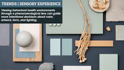
Human-centered design invites us to think beyond function and deeply examine how the built environment makes us feel. Acoustics, lighting, materiality, color, and scale create stimuli that can directly impact how a space is perceived and experienced. Phenomenology offers one framework for sensory-informed design, helping designers consider how behavioral healthcare environments are interpreted emotionally and psychologically.
Drawing on lessons from The Brook in-patient unit, the Design in Mental Health Network identifies several goals of sensory-informed design:
- Reduce anxiety and distress
- Support self-regulation and calm
- Prevent escalation from sensory overload
- Make care more accessible and inclusive
- Foster autonomy, engagement, and recovery
The 2026 Facility Guidelines Institute (FGI) Codes and Handbooks reinforce this approach through requirements and guidance for therapeutic behavioral health environments, including spaces that support sensory regulation.
By integrating phenomenology, interior designers can create behavioral healthcare spaces intentionally shaped around the sensory and emotional needs of the patients they serve. Elements like color, lighting, artwork, and form are then evaluated for how they can affect the patient experience and how the physical space itself can function as part of the facility’s therapeutic practice.

Four Ways to Use Phenomenology in Behavioral Healthcare Design
Designers can apply phenomenological thinking to behavioral health environments through four interconnected considerations:
- Principle #1: Color Informed by Context
- Principle #2: Inspiring Artwork
- Principle #3: Abstract Forms
- Principle #4: Balancing Light and Color
Color Informed by Context
Color theory is an important consideration when designing healing spaces. The environment should be harmonious without being jarring or upsetting to patients. The therapeutic advantages of color have been well-noted for decades. However, rather than approaching color theory from broad perspectives, such as shades of blues or greens being calming, it is more important to build the palette based on the unique patient population, culture, and location. Evaluating factors such as cognitive ability, function of the space, and influences from the surrounding environment can help to create meaningful color integration.
Additionally, considering the cumulative impact of color is also important, requiring designers to look beyond flooring and wall coverings and contemplate how signage, artwork, furnishings, and exterior views will impact the sensory load of their design.
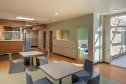
Aliso Ridge Behavioral Health, a licensed acute psychiatric hospital offering comprehensive inpatient and outpatient services in southern California, embraced a localized color palette by pulling influence from the region’s landscape and Mission-style design sensibilities. A warm, earth-toned palette mimics the local vernacular and native plant life to promote a calming environment. This approach also helps the facility blend into its surrounding community and establish a less institutional identity.
Inspiring Artwork
As established in Part I and Part II of this series, artwork can be a positive distraction for behavioral health patients. However, wall hangings and decorations can be hazards for patients who are at risk of self-harm. These elements must also be able to withstand extreme impacts and rigorous cleaning cycles. In some environments, wall hangings may be omitted altogether in an effort to enhance safety, but this can leave the interior feeling sterile and institutional.
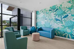
Gold Coast Secure Mental Health Rehabilitation Unit, located in Australia, has approached these challenges by transforming functional wall protection into inspiring and soothing works of art. Partnering with local artists, the facility is accented with custom murals that infuse the center with a distinct identity and cultural significance. First Nations storytelling elements are woven into depictions of native flora and fauna that span the walls. Transparent, rigid panels applied over the designs achieve necessary protection without sacrificing the artwork’s beauty or visual integrity. The seamless protective treatment allows the artwork to contribute to a more residential atmosphere while addressing pick resistance and other patient-safety requirements.
Abstract Forms
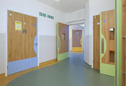
Some mental health conditions can affect memory, attention, and processing speed, creating additional wayfinding challenges. In some environments, distinct imagery may be distracting or agitating for patients who are struggling to orient themselves. Visual cues such as abstract formations and color blocking can be used to simplify visual information and support navigation. Although different patient populations will respond differently to various visual details, abstract forms that incorporate curved shapes and soft tones can often be soothing while also minimizing the visual complexity of concrete forms or text-based signage when applied to corridors or other navigational areas.
The design of London’s Wellesley Ward at the Royal Hospital for Neuro-Disability features a gentle color palette and rounded forms. Strategic color blocking helps patients navigate the space by defining zones and creating easy-to-interpret familiarity within the building.
Balancing Light and Color
Both light and color can positively enhance a patient’s healing journey. However, they also hold a unique relationship with each other. The exposure and color temperature of light are important design considerations when choosing an interior color palette. Light can influence how the tone, depth, and saturation of a color will appear. Because of this, it is often beneficial to evaluate a large sample of the paint color or material against the actual lighting conditions of the space during different times of the day.
It is also important to remember the FGI Handbook recommendations to leverage lighting as a means to support the therapeutic environment and planned treatment programs. This can vary greatly depending on the facility, but controllable lighting and safe access to natural light are often favorable.
Phenomenology encourages designers to consider behavioral health environments not as a collection of individual finishes and features, but as a complete sensory experience interpreted differently by each patient. Color, artwork, form, and light work together to influence how a space is perceived, navigated, and experienced. By evaluating these elements in relation to patient needs, treatment goals, and the surrounding environment, designers can create spaces that feel less institutional while remaining aligned with therapeutic care.
In Part IV of this series, we will examine another essential layer of behavioral healthcare design: how thoughtful product specification can address safety requirements while supporting the dignity and comfort of patients.
About the Author
 Amy Sweeting
Amy Sweeting
Amy Sweeting is the Product Manager for Interior Product Solutions at Construction Specialties, where she drives the strategic direction and lifecycle management of innovative products for commercial interiors. With over a decade of experience at CS, Sweeting has held diverse roles giving her a unique perspective on both operational execution and customer needs.
In her current role, Sweeting partners with cross-functional teams and clients to translate market insights into solutions that enhance functionality, aesthetics, and performance in interior spaces. Her approach combines design expertise with data-driven decision-making to ensure products evolve with industry trends and customer expectations.
Sweeting earned a Bachelor of Science in Interior Design from Meredith College in Raleigh, NC, and holds a Lean Six Sigma Green Belt Certification from Rutgers University, along with an Evidence-Based Design Certification—reinforcing her commitment to creating interior environments that enhance well-being, performance, and productivity.