As a healthcare provider, the Swedish brand already enjoyed a strong presence on the West side of Lake Washington in Seattle, but officials wanted to establish an equally solid East side campus and make Swedish the pre-eminent hospital system in its growing community.
Enter CollinsWoerman, the Seattle-based architecture, design and planning firm that designed and built a new facility for the organization in Issaquah, Wash. that many residents are comparing to a spa. What is more impressive is the fact that they did it in just under three years. (Most healthcare projects take upwards of four years to complete, according to Sarah Reisenauer, senior associate with CollinsWoerman.)
In order to establish itself in the area, the firm needed to create a branding identity for Swedish on the East side of the lake. “Swedish has a strong emphasis on technology and professionalism, and wanted to be familiar and friendly at the same time,” says Reisenauer. But besides technology integration and building a sense of community (not just for area residents but amongst hospital staff as well), a large emphasis was put on the building’s energy consumption, as the new Swedish/Issaquah Medical Center uses 43 percent less energy than a typical hospital.
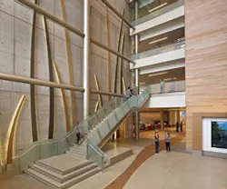
The lighting CollinsWoerman specified was a main contributor to its energy reduction efforts. “The lighting power density of the project was .79 watts per square foot, compared to the Washington state code requirements, which are 1.2 watts per square foot for a hospital,” explains Reisenauer. “So we’re well under the energy consumption in terms of the lighting,” which are mainly LED and fluorescent. The facility’s sustainable profile is bolstered by the use of low-flow urinals, dual flush fixtures, low-VOC adhesives and coatings, as well as 10,500 square feet of reclaimed wood on the public elevator bank cladding (an anchoring element in the central atrium).
The firm also looked to push technological boundaries in the new hospital by doing away with the standard registration desk. “That’s been replaced with a more dispersed reception model,” Reisenauer says. “Check-in is at the various locations of departments, as opposed to the very front desk.” CollinsWoerman also placed intuitive kiosks throughout the facility to assist in wayfinding. Beyond the common areas, patient rooms feature a computer station for bedside patient/caregiver interaction, as well as lighting and TV controls, a room service system and Wi-Fi. Data and game connections are also available in pediatric in-patient rooms.
The accessibility and ease of movement provided by the facility reinforces Swedish’s emphasis on familiarity, but many physical attributes of the center also mimic the brand’s identity, with numerous nods to the arch in its logo art. The main atrium is slightly curved, and graphics representing a flowing blade of grass are located throughout the building; large-scale blades hover over visitors in the atrium, while smaller-scale examples can be seen in the ceiling elements of the imaging department and in abstracted versions at nurse stations.
But besides Swedish’s logo art, the arched grass stalks also represent a connection to the nature that surrounds the property (including the open prairies the site was built upon, and grasses and trees). “Nature, nurture and community” was the overall design concept for the project. Outdoor spaces are plentiful, with trails that wind around the entire campus, a courtyard between the two legs of the hospital, and a green roof on top of the first floor that inpatient occupants can look out onto from their rooms.
The “nurture” component to the design is what Reisenauer calls the “taming of the nature.” “Crisp lines are applied to organic materials with lots of references to ‘L’ shapes and ‘U’ shapes, which refer to portions of an embrace or of nurturing,” she explains. The L-shaped portals are located at various wayfinding intervals, such as the start of each department, or at nurses’ or reception stations. “We repeat those strong elements at wayfinding decision points so people know they’re at a significant point in the patient journey.”
The final component, community, is one of the largest organizing principles of the overall layout of the space. A main goal was to create a community within the hospital complex. A green room is provided for staff, “which is a departure from what a lot of hospitals do, as there will be different lounges for different types of workers in different parts of the hospital,” Reisenauer says. “Instead, we have one large gathering space above the café on the second floor where staff of all types can eat their lunch or have smaller, more impromptu meetings.” The general shape of the building also reinforces the sense of community with the large central atrium and courtyard, as well as the inclusion of retail spaces and educational components.
All these elements combined have made for a healthcare project that seems to borrow heavily from the world of hospitality. The result is a space that has been absolutely embraced by residents as a positive resource. As Reisenauer puts it, “We just tried to make it feel like it belonged in the community, as opposed to just one more institution.”
SOURCES:
back to top
|
flooring Deco-Pour Devereux International | 1 Johnsonite Shaw Contract | 2 Statements Tile, Abisko Toli casework & millwork C S Acrovyn |
TerraMai surfacing Pionite Wilsonart stone Spring USA glass and glazing Pulp Studio |
paint and coatings Sherwin Williams metal work/column covers Fry Reglet Pittcon Industries Schluter ceilings Chicago Metallic | 6 USG | 7
|
privacy curtains lighting Candela Cooper Industries Focal Point Kurt Versen Litelab Resolute | 8 WAC Lighting | 5 Winona Lighting Zumtobel |
CONTACT:
back to top
|
client project team |
project team contractor mechanical/plumbing/med gas |
medical equipment planning landscape graphics acoustician photography |
About the Author
AnnMarie Martin
Editor-in-Chief
AnnMarie is the former Editor in Chief of i+s and has been covering the commercial design space. Her style and vision has helped the brand evolve into a thought leader in purpose-driven design and cultural movements shaping the way we live and work.

