2027 Color Trends—Getting Grounded with Green
Key Insights
- Green is showing up across multiple 2027 forecasts—not just paint brands.
- Olive, moss, sage, yellow-green, and chartreuse each bring a different mood.
- Consumer research points to a growing desire for comfort, retreat, and connection to nature.
- Designers are pairing green with clay, plum, muted pink, blue, and warm neutrals.
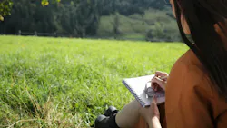
Apparently, 2027 wants us to touch grass.
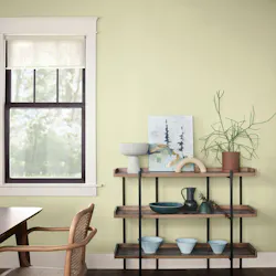
Behr’s Grounded and Sherwin-Williams/HGTV Home’s Celery are very different greens, but the fact that both landed in this territory feels less like coincidence and more like a signal. One is earthy and olive-based; the other is lighter, fresher, and more yellow. Both point toward a broader appetite for interiors that feel connected to something natural, familiar, and steady.
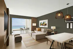
The interesting part is that this isn’t just color forecasting washed with wellness language. And signals from both consumers and industry forecasters point in the same direction.
Behr’s survey of 1,000 Americans found that 77% turn to nature when life feels chaotic. Another 86% said home projects help them create a place to retreat and recharge. That suggests the pull toward green may be less about biophilia as a design trend and more about what people want spaces to do for them.
Color Marketing Group sees the pull toward green extending well beyond the U.S. market. In “The Strategic Value of Color Marketing Group® Color Forecasts,” published in Paint & Coatings Industry e-magazine, president Montaha Hidefi wrote:
“For the first time since 2011, the year CMG adopted the notion of key colors, a strange and remarkable synergy occurred. Three of the four regions recognized green as the Key Color. I called this a ‘key planetary alignment’ for its one-of-a-kind manifestation.”
The color directions uncovered by CMG for Asia-Pacific, North America, and Europe show obvious visual differences. Yet together, I think they propose a collective desire for clarity, regeneration, and more intentional forms of energy.
- Asia-Pacific’s color direction and CMG 2027+ Key Color “Germinate” are described as “a moderate stance, an evolution toward quieter, more contemplative shades.” Hidefi said the clear true green “reflects the surfacing of a new unbiased consciousness…that embraces subjectivity and freedom from judgment while remaining deeply connected to cultural and historical roots.”
- In North America, a color direction “driven by economic restraints, shifting values, and a yearning for clarity” led to CMG 2027+ Key Color “Cellular”—a pale yellow-green that appears a close cousin to Sherwin-Williams’ COTY. “Cellular captures the collective craving for emotional, ecological, and creative restoration,” Hidefi said.
- Last, Europe’s 2027+ color direction speaks to a reawakening to “self-expression, sensory recalibration, and psychological grounding.” Its Key Color “Endorphin” signals “vitality and mood regulation.” Hidefi described the medium chroma, clean green with a touch of yellow as “vibrantly luminous.”
Stacy Garcia Design Studio’s 2026/27 forecast
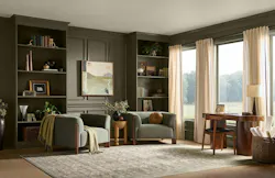
- suggests interior designers are already interpreting green in several different ways. It shifts from dark and earthy in material-driven, Brutalist-inspired spaces to muted sage alongside clay and stone, airy herbal tones in more restorative interiors, and olive used to balance richer, heritage-influenced palettes. Even chartreuse has a place, showing up as a high-energy accent in more expressive, maximalist schemes.
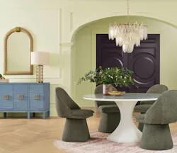
Across these forecasts, green isn’t working alone. The accompanying palettes move through clay, warm neutrals, muted pinks, blue, plum, and other earthy tones—colors that feel less decorative than anchoring.
I should note one player missing from this discussion: While Pantone Color Institute hasn’t yet released its 2027 Color of the Year, executive director Leatrice Eiseman’s color commentary from New York Fashion Week Spring/Summer 2027 seems to lean toward a similar expression:
“Blending feelings of joy with the growing movement to connect with the natural world, colors for NYFW Spring / Summer 2027 encourage individual expression and continuous experimentation.”
The overall 2027 color story doesn’t appear to chase novelty—which echoes what the interiors+sources team has been seeing and hearing from the industry all year. Instead, color seems to be taking on a more purposeful role: helping spaces feel calmer, more rooted, more personal, and maybe a little less deliberately polished.
As staff writer Lauren Brant put it earlier this year, “emotionally intelligent color” is on the rise—combining shades that both ground and invigorate spaces while remaining approachable and timeless.
Green may simply be the clearest expression of that larger shift. As for me, I’m giving this color trend the green light.
*Article outline and key highlights generated using AI assistance. All writing and editing was performed by interiors+sources staff and reviewed for clarity and accuracy.
About the Author
 Carrie Meadows
Carrie Meadows
Head of Content
Carrie Meadows is Head of Content for interiors+sources, where she leads editorial strategy, content development, and brand storytelling focused on the people, projects, and innovations shaping the design industry. With more than two decades of experience in B2B media, she has built a career connecting technical expertise with creative insight—translating complex topics into meaningful stories for professional audiences.
Before joining interiors+sources in 2024, Carrie served as Editor-in-Chief of LEDs Magazine within Endeavor Business Media’s Digital Infrastructure & Lighting Group, guiding coverage of emerging lighting technologies, sustainability, and human-centric design. Her earlier editorial experience spans across Laser Focus World, Vision Systems Design, Lightwave, and CleanRooms, where she managed print and digital publications serving the optics, photonics, and semiconductor sectors.
An advocate for clear communication and thoughtful storytelling, Carrie combines her editorial management, SEO, and content strategy expertise to help brands and readers stay informed in a rapidly evolving media landscape. When she’s not crafting content, Carrie can be found volunteering at a local animal shelter, diving into a good crime novel, or spending time outdoors with family, friends, and her favorite four-legged friends.