Design Pros Decode the 2026 Color Forecast: Calm Foundations and Expressive Hues
What Designers Should Know
-
Color as a signal: 2026 forecasts emphasize mindset shifts over a single defining hue.
-
Calm takes priority: Many 2026 colors reflect a desire for clarity, balance, and reassurance.
-
Character, carefully: Richer tones add depth without overpowering calm foundations.
-
Emotion leads design: Color choices focus on how spaces feel, not just how they look.
-
Shared experience matters: Palettes reflect collective needs for optimism and well-being.
Each year, Color of the Year announcements offer more than a glimpse at what will show up on walls, furnishings, and finishes—they reveal how design is responding to cultural pressure, emotional needs, and shifting definitions of value.
Taken together, the 2026 Color of the Year selections signal a clear pivot: away from trend-chasing spectacle and toward intentional design grounded in purpose, longevity, and emotional resonance.
From deep, tailored neutrals to ethereal whites, expressive greens, and unapologetically optimistic yellows, the 2026 color landscape reflects a profession recalibrating itself. Designers are asking not just what looks good, but what lasts, what supports well-being, and what feels meaningful now.
The New Foundation: Quiet Strength and Essentialism
Several 2026 colors anchor themselves in restraint and refinement, embracing neutrality not as a safe default, but as a deliberate design philosophy.
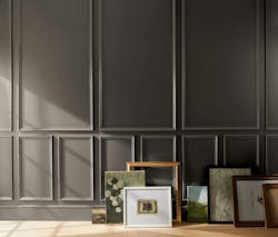
Benjamin Moore’s Silhouette AF-655, a rich espresso brown softened with charcoal undertones, embodies this shift. Inspired by classic suiting, the color reflects a renewed appreciation for craftsmanship, tailoring, and detail. It’s a neutral with presence—confident without being loud—well suited to hospitality, residential, and workplace environments seeking warmth without excess. The paint is Certified Asthma & Allergy Friendly.
“The connection between fashion and interiors has always been a source of inspiration, but this year in particular, we’ve noticed a renewed interest in suiting and classic silhouettes; the resurgence of timeless pieces; and the growing interest in the brown color family,” said Andrea Magno, director, color marketing & design at Benjamin Moore. “Silhouette embodies these qualities with its depth and luxurious blend of burnt umber and delicate charcoal undertones. Like a perfectly tailored suit, this hue has the versatility and softness to bring a space from expected to exceptional.”
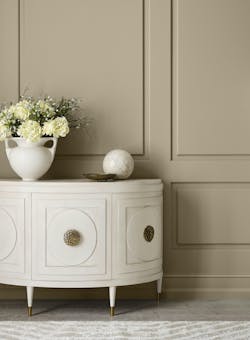
Similarly, Sherwin-Williams’ Universal Khaki grounds interiors in essentialism, a philosophy that prioritizes quality, function, and emotional durability over accumulation. Khaki’s long history in workwear and utility gives it an inherent sense of honesty and material integrity. In commercial interiors—particularly adaptive reuse projects—it offers stability and warmth while pairing seamlessly with layered textures, metals, and biophilic elements.
“There’s something enduring about khaki—it bridges the past and the future in a way that feels both familiar and forward-thinking,” said Trendsight Team color strategist and Director of Color Marketing Sue Wadden. “Historically, khaki dates back to the mid-19th century. The name comes from a Persian word meaning ‘dust’ or ‘earth,’ in reference to the color’s nature-based tone.”
Together, these tones signal a collective return to core neutrals that do more than fade into the background. They create frameworks for design rather than destinations, allowing spaces to evolve without feeling dated.
Clearing the Noise: Whites as Emotional Reset
If darker neutrals provide grounding, white in 2026 offers release.
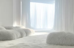
The Pantone Color Institute’s PANTONE 11-4201 Cloud Dancer is not a crisp, clinical white, but a soft, billowy hue that functions as a visual exhale. Emerging from a cultural moment defined by overstimulation and digital fatigue, Cloud Dancer represents clarity, rest, and renewal.
Described as a “blank canvas,” this airy white encourages designers to strip away excess—visually and conceptually. In interiors, it supports focus and calm, making it especially relevant for healthcare, education, and residential settings where mental and emotional well-being are paramount. As a structural color, it also provides scaffolding for more expressive palettes, proving that simplicity can be quietly powerful.
“PANTONE 11-4201 Cloud Dancer embodies a shift in how we live and design,” said Laurie Pressman, Vice President of the Pantone Color Institute. “An airy white hue, Cloud Dancer exemplifies our search for balance between our digital future and our primal need for human connection.”
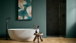
Emotional Color Returns: Greens, Blues, and Jewel Tones
While restraint defines much of the 2026 palette, it is far from monochromatic. Designers are re-embracing emotionally intelligent color—hues that energize without overwhelming.

Behr Paint Company’s Hidden Gem, a smoky jade blending blue and green, reflects this desire for balance. Both grounding and invigorating, the color responds to a growing appetite for shades that feel personal and expressive while remaining timeless. Research cited by Behr underscores what designers already know instinctively: Color influences confidence, mood, and perception of space.
“Now more than ever, there’s a growing appetite for colors that challenge convention and bring an unexpected sense of wonder to everyday spaces,” said Erika Woelfel, VP of Color and Creative Services at Behr Paint. “Hidden Gem captures that spirit in both name and color—its depth and refinement meet the desire for colors that are eternally stunning and stylish.”
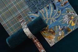
Textile manufacturer Brentano expands this emotional range through a 2026 forecast rooted in nostalgia and reinvention. Jewel-like tones such as Deep Zircon, alongside comforting neutrals like Dark Chocolate and luminous hues like Green Aventurine, draw on memory, craft, and layered storytelling. These palettes invite intimacy and warmth, offering designers tools to create spaces that feel lived-in rather than styled.
Meanwhile, 3form approaches color through materiality itself, with its 2026 direction emphasizing historically rooted pigments, subtle “minor key” hues, and light-activated translucency—reminding designers that color is not static, but experiential. Its palette draws from geographically and culturally inspired pigments, exploring how shades like red and blue migrated through trade and time to bring narrative depth and authenticity to contemporary spaces.
Designers continue to gravitate toward rich, aquatic blues and enduring neutrals for visual stability and emotional resonance in an overstimulated world. For 3form, nuanced, less obvious “minor key” colors created through layered films and soft saturation offer an expressive alternative to bold primary palettes. Meanwhile, light-activated translucency expressed through glass and resin transforms spaces with shifting shadows, glow, and mood-changing effects, offering an immersive architectural experience.
Optimism, Reclaimed: Color That Energizes Shared Spaces
Amid all this calm and grounding, one message stands out: Design is ready to feel hopeful again.
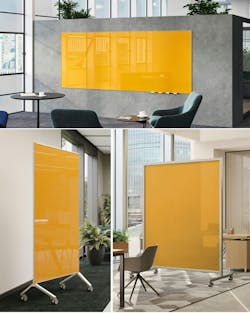
Ghent’s 2026 Color of the Year, Marigold, unapologetically embraces optimism. A warm yellow infused with orange undertones, Marigold is designed to spark creativity and engagement in learning, workplace, and healthcare environments. Where many brands continue to retreat into neutrality, Ghent’s approach reflects a belief that shared spaces should energize, not merely soothe.
Paired with grounding tones like Denim, Cactus, and Terra, Marigold demonstrates how expressive color can coexist with balance—offering activation without chaos.
“Design should do more than exist; it should energize,” said Susan Claus, Ghent’s Director of Marketing. “Marigold reminds us that color has the power to inspire new ideas, spark connection, and bring joy back into everyday spaces. It's not here to blend in. It’s here to stand out.”
A Unifying Thread: Design With Purpose
Across brands and categories, the 2026 Colors of the Year reveal a profession responding thoughtfully to a complex world. The common thread is intentionality:
- Neutrals are richer, warmer, and more nuanced.
- Whites are softer and emotionally driven.
- Color is expressive, but never arbitrary.
- Material honesty and longevity matter more than novelty.
For designers and specifiers, 2026 is less about chasing what’s new and more about choosing what endures—emotionally, culturally, and materially.
About the Author

Lauren Brant
Staff Writer, interiors+sources and BUILDINGS
Lauren Brant is Staff Writer for both interiors+sources and BUILDINGS. She is an award-winning editor and reporter whose work has appeared in daily and weekly newspapers. In 2020, the weekly newspaper won the Rhoades Family Weekly Print Sweepstakes—the division winner across the state's weekly newspapers. Lauren was also awarded the top feature photo across Class A papers. She holds a B.A. in journalism and media communications from Colorado State University-Fort Collins and a M.S. in organizational management from Chadron State College.