How Movement Data Guides Retail Planning
What Designers Can Learn from Daily Movement
- Mobility data reveals how residents and commuters actually move, uncovering retail opportunities conventional trade-area analysis can miss.
- Daily-use tenants—such as healthcare, quick dining, and services—can better align mixed-use retail with routine community needs.
- Parking, signage, and storefront design should support quick access, clear visibility, and safe movement between vehicles and pedestrians.
- By planning around observed behavior rather than fixed category assumptions, designers and developers can create more responsive retail environments.

A family of four in a Houston suburb doesn’t think about retail in terms of categories. They think in errands stitched into a week: school drop-off, prescription, dog food, and something for dinner that doesn’t add a 20-minute detour. What makes a place useful or invisible to them is the texture of that week: who is in the car, what time of day, and which way the route bends. And it is almost entirely missing from the way mixed-use retail gets planned.
The familiar rhythm is well known among developers and architectural professionals: Pull a gap analysis, identify underserved categories within the trade area, allocate square footage, and talk to tenants. It works well enough. What this process can’t tell you is how the household actually moves. The real question for a mixed-use ground floor isn’t “What’s missing from the trade area?” It’s “What’s missing from the route?”
When the Route Tells a Different Story
Mobility data makes the route visible. On a ground-up project in a high-growth master-planned community in the Houston metro, our team layered commuter traffic, visitor behavior, and tenant performance over the existing retail map.
Author’s Note: The project described is illustrative and still in development, so it appears here in general terms. Figures are drawn from owner-reported operating data, U.S. Census tract data, and trip-generation estimates derived from standard industry rates for the proposed uses.
Layering placed three things over the same map: the corridor volumes moving past the site morning and evening, the visit behavior at the centers already open nearby, and how individual tenants inside those centers were performing. The corridor layer is built the way a traffic study is built, by applying published trip-generation rates for each proposed use to the program being considered, then testing that against the existing counts on the road. Each layer answers a different question—how many people pass, how they use what is already there, and whether it is working—and the useful information sits in the places where the three disagree.
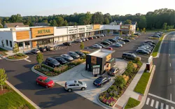
The dominant center was fully leased, pulling more than half a million visitors a year. By every conventional metric, the market looked saturated. Three readings pointed that way: occupancy, total annual visits, and a standard trade-area gap analysis that found the major categories already accounted for within a three-mile ring.
The real question for a mixed-use ground floor isn’t “What’s missing from the trade area?” It’s “What’s missing from the route?”
It turned out the market wasn’t saturated. That center was working as a destination. Shoppers planned a trip, drove there, then left. The specific reading that broke the saturation story was format, not category: The center had no drive-through capacity and no convenience frontage anywhere in it, which meant that however fully leased it was, it could not serve a stop on the way to work.
The market was not short of retail. It was short of a kind of retail. Residents were passing it on their daily commute and stopping elsewhere for what they needed day to day, such as healthcare, services, and quick food.
That conclusion came from where the supply actually sits, not from watching residents. The nearest full-service grocery, the junior boxes, and most service tenants were clustered roughly three miles out at a separate town center, and the rest of the convenience and fast-food supply was scattered along the highway rather than inside the community. A daily-needs trip had to leave. The corridor people actually drove every morning had nothing useful along it. The result was a highway lined with destinations at the exits and almost nothing in between.
From Trade Area to Daily Need
The site anchor strategy shifted, and what shifted was the definition of the anchor rather than its size. The working assumption had been a conventional retail anchor: a grocery or soft-goods box sized to pull shoppers from across the trade area.
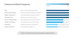
Instead of competing with the destination mix already working a mile away, the program moved toward what the route was missing: urgent care, pediatric dental, tutoring and enrichment, pet care, quick-serve restaurants. Those were the categories the analysis actually recommended for that site, and they are also representative of what this household profile tends to surface elsewhere.
In the recommended program, the junior anchor became a 12,500-square-foot medical and urgent-care building, with drive-through and quick-serve pads at the intersection—frequency holding the center together in place of trip length.
A traditional gap report will often name these categories as underserved, but it stops there. It measures category supply against spending potential inside a drawn boundary, which tells you what is missing from the trade area rather than what is missing from the route—and not that the missing thing needs a drive-through lane on the corner rather than an in-line suite at the back.
The most durable places have always organized themselves along the lines of movement of the people who use them. What’s new is that we can finally see those lines clearly enough to design to meet the needs of everyday people.
These recommendations become obvious once you look at who lives there and how a week is choreographed. U.S. Census tract data for the trade area showed a median age of 34, an average household size of 3.0, and a workforce more than 85% white-collar: young families, largely dual-income, with school-age children and daily commutes.
The underserved categories almost name themselves. The chain is short. A family-dominant, dual-income profile generates childcare, pediatric care, tutoring, and family dining demand at predictable hours, and a white-collar workforce passing the site twice a day creates the morning and evening capture window that coffee, quick-serve, and grab-and-go concepts depend on.
Another key signal emerged from that project. A national specialty retailer’s store inside the community was outperforming the same brand’s location in the metro’s premier luxury mall—the kind of non-obvious data point that reframed the demand thesis for the entire site. What it broke was the assumption underneath the trade-area model. Purchasing power and visit frequency here were running ahead of what population density predicted, which meant demand depth had been read too conservatively across every category, not only that one.
This is, in a quieter way, an old idea. The most durable places have always organized themselves along the lines of movement of the people who use them: shops where the path bends, services where the school day ends, the corner that catches the route home. What’s new is that we can finally see those lines clearly enough to design to meet the needs of everyday people.
Designing for Shorter, More Frequent Visits
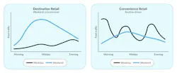
When the tenant mix is shaped by behavioral data, some interesting things happen to the architecture. Visits get more frequent and shorter. Foot traffic spreads across morning, midday, and evening rather than concentrating on weekends.
In our site example, a pediatric dental office next to a tutoring center creates a parent drop-off loop that only works if circulation supports it. That loop wants a clear sightline from the parking area to both entries, a covered walk between them, and a coffee or counter-service tenant nearby where someone can sit for thirty minutes without feeling like they’re loitering. In plan it comes down to a short-term bay of eight to ten spaces set directly in front of the two doors, with the through-drive pushed behind it, so a parent can park once, walk two children to two different entries, and get back to the car without crossing moving traffic.
When the adjacency logic sits in the program before leasing opens, the leasing team is placing tenants against a rationale rather than filling slots in signing order, and a tenant who asks for the corner can be shown why the corner belongs to a different use.
That triangle of uses is the kind of small social ecology that gives a place its character. None of it is complicated. None of it happens if adjacencies were decided by whoever signed their lease first. That is what moving the analysis earlier actually buys. When the adjacency logic sits in the program before leasing opens, the leasing team is placing tenants against a rationale rather than filling slots in signing order, and a tenant who asks for the corner can be shown why the corner belongs to a different use. The conversation changes from which space is available to which position performs.
Drive-throughs need queuing and vehicle-pedestrian separation that a sit-down restaurant never will. That separation isn’t only a safety problem; it’s the difference between a place that reads as a place and one that reads as a parking lot with buildings on it. Handling it well is mostly a question of which element yields. Put the pads at the intersection with the stacking lane on the outboard edge, so the queue runs away from the storefront face rather than across it. Carry the pedestrian walk over the drive aisle at full height with a change in paving, so the car crosses the walk instead of the walk stopping for the car. Screen the lane with a low hedge rather than striping. The moves are ordinary; the sequence is what keeps the place from reading as a lot.
Storefronts shift, too. Convenience tenants rely less on display and browsing and more on visibility and speed of access. Signage matters more than window merchandising. The frontage has to communicate what’s inside in about three seconds—sometimes at thirty miles an hour, sometimes at walking pace. That’s a different design brief than creating an environment someone wants to wander into. Destination retail rewards immersion: enclosed, layered, slow. Convenience retail rewards permeability: short paths from car to counter, edges you can read at a glance, a building that meets the street rather than turning away from it. These are two very different spatial logics, both labeled “retail” on a site plan.
Collecting, analyzing, and interpreting movement data allows architects to quantify their professional expertise in observing and understanding community behavior and needs.
Moving the Design Conversation Upstream
Mixed-use ground floors sit where lease economics, pedestrian experience, vehicle access, and brand identity all collide. The design team doesn’t always get a seat at the table early enough to shape that intersection. By the time architects are involved, the tenant mix is set and the lease plans are drawn. The design work becomes a fit-out of someone else’s program.
The useful entry point is earlier than most teams assume: at program definition, while the anchor type and the split of square footage are still open, and at the same moment the market and feasibility work is commissioned. That is well before an LOI, let alone a lease plan. Entering then costs a few weeks of design time and changes what gets built. Entering after the lease plan is drawn costs the same weeks and changes almost nothing.
Data-informed tenant strategy can change that. When you can show a client that daily needs along a specific corridor are going unmet, the program starts writing itself, and the design logic follows.
Circulation depth, storefront proportions, parking adjacency, signage zones, the rhythm of openings along the street all become clearer when the tenant mix is grounded in observed life rather than category averages. Because the data is specific to a site and a community, it gives the design team something concrete to design around rather than a generic program that could belong to any project anywhere.
Parking is the clearest case. The blended ratio is not a site decision, it is a tenant-mix decision: Quick-serve concepts need roughly eight spaces per thousand square feet, while medical and general retail need five. Shift the mix toward drive-through and clinic uses and the required count moves by dozens of spaces, which moves the depth of the parking field, which moves the building line and the number of curb cuts. Same acreage, same coverage, a different plan—and the movement data is what tells you which one you are drawing.
Architects have always known that a good ground floor is measured in a five-minute walk: what fits comfortably into the daily round of the people who live nearby. Mobility data is finally letting us measure what we used to have to argue for. Tenant mix stops being a fixed program we configure space around, and starts being something we help shape, because the spatial logic is visible in the route from the start. The work moves earlier. The design team moves with it. Collecting, analyzing, and interpreting the data allows architects to quantify their professional expertise in observing and understanding community behavior and needs.
More on Retail/Mixed-Use Design


About the Author
Patrick Chopson, AIA
Patrick Chopson, AIA, is Co-Founder and Principal of cove, an AI-powered architecture firm transforming how buildings are designed and delivered. A licensed architect with 20+ years of experience, technologist and building scientist, Patrick focuses on the intersection of AI and Architecture.
He previously co-founded the building performance consultancy Pattern r+d and co-authored Build Like It’s the End of the World (Wiley, 2025), a guide to decarbonizing AEC. His work has been featured in Architect Magazine, TechCrunch, and ArchDaily, and he regularly collaborates with developers and industry leaders on next-generation solutions.