Patcraft’s New Carpet Tile Collection is a Result of Curiosity and Collaboration
Within the halls of Patcraft’s home base in Dalton, GA, curiosity often leads to fresh ideas. This holds true for the carpet and resilient flooring company’s newest collection, Colour Interference, launching in November. The inspiration for Colour Interference is one that highlights the collaborative process, core to the Patcraft brand.
“Colour Interference has a unique inspiration story, as it connects to our overall process at Patcraft, which is different from other collections that originate from an artistic endeavor or market insights,” says Shannon Cochran, Patcraft’s vice president of creative and design. “The collection truly began from curiosity and collaboration, and it is a great example of how, as a team, we connect with one another to broaden our understanding of a product solution.”
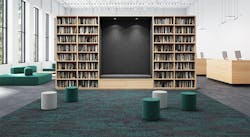
The resulting carpet tile collection features 20 colorways that build in intensity throughout three different styles. Colour Interference explores a vertical transition of color to create vibrant flooring designs.
See how you might use Colour Interference within commercial interiors and learn more about the carpet tile’s inspiration through the following Q&A.
i+s: What is the inspiration behind Colour Interference?
Shannon Cochran: Corey Twilley, a Patcraft product technician, was supervising the run of another product line when he noticed an interesting pattern developing as the colors shifted and transitioned between patterns. Recognizing that this was a unique visual, he brought a sample of this carpet tile to one of our product designers, Ron Powell, noting interest in the nubby texture and the way the color was coming through in the transition.
Over the next several weeks, Ron and the design team worked to bring this visual to life in a new carpet tile collection. Ron studied the vertical shift in color as he envisioned the look in a plank product, thinking through possibilities for texture and pattern. The process was an interesting challenge as Ron and the team played with layering the pattern and a vertical color transition to intentionally highlight the bold hues that give length to the plank’s visual.
The patterns were inspired by the initial sample that Corey brought to our team, where the knots gave way to rich color and a unique visual. It was a fun challenge to work through the process in a different way to recreate this design.
i+s: How important is exploration during the product development process for Patcraft when creating a new collection?
SC: Exploration is a huge part of our product development process. Our design philosophy is based on curious observation—a process that inspires us to explore what we see and hear, asking questions to arrive at innovative design. Our collections are then designed with these intentions in mind, as we discuss how to bring a product to life based on inspiration from our customers, our own experiences and the influences of the world around us.
As we explore, our observations and experiences shape how we see design. It’s an approach that leads us to develop product solutions that are a balance of what the customer is looking for and where Patcraft’s strengths are.
Colour Interference is a great example of this process. The slightest change in color and texture caught Corey’s eye—and this was the spark of an idea for a new collection. Ron built on this idea, using insight, experience and creativity to design a flooring solution that was born out of curiosity.
i+s: What types of environments do you see Colour Interference working best in?
SC: We love the bold use of color in this collection and the way the color builds throughout the pattern to create transition and movement across the floor. This makes it a great product for multiple end-use environments, including education.
With linear elements that give length to the pattern, the collection creates movement for wayfinding and definition of space. The patterns are designed to encourage collaboration, guide movement and infuse energy within the built environment.
i+s: What are the benefits of using carpet tile within these interior spaces?
SC: As we think through product plans, we discuss so many different elements and how they can enhance the human experience within the built environment. We consider the impact of our physical space and its role in creating connections, sparking collaboration, evoking a sense of comfort or enhancing wellbeing. And to that end, we also envision scale, contrast, texture, color and pattern, including how these features influence the design of our collections and, ultimately, the spaces in which they are used.
Through soft, familiar textures and colors used within design, carpet tile patterns can evoke a sense of comfort and wellbeing in commercial interiors. We can use color and shape to help communicate function within a space or naturally direct movement. Carpet tile is also a great product choice to help balance acoustics within the built environment.
Read next: Elizabeth Whelan Design Creates an Innovative Fabric Infused with LED Yarn
About the Author

Adrian Schley
Associate Editor
Adrian Schley was an Associate Editor for i+s, where she covered the commercial interior design industry since 2018. Her work can also be found in BUILDINGS and Meetings Today.
