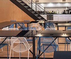
In the growing and competitive world of startups, individuality is key: in retaining employees, in signing work with clients, and at times, dealing with long, busy days. For data company BlueCore, moving offices not only signified that those extended hours were paying off, but also that they were coming home. Nestled in Manhattan’s Lower East Side, the startup has been working with Justin Huxol of HUXHUX Design to put its stamp on the building which once stood as a speakeasy. The four-level raw building has a mix of open offices, communal spaces, private phone booths, and quirky meeting rooms named for spots around the neighborhood in which they reside.
In putting its fingerprint on the building and community, color was taken into consideration. Looking through a small glass door while touring the office, a woman from sales was seen bathed in a vibrant green; down the hall, a meeting let out washed in yellow. Color radiated, but never overtook the space.
We sat down with Huxol to discuss the location and use of color, and how both are boosting this new wave of office as space to roam.
interiors+sources: How did you become involved in the process?
Justin Huxol: [BlueCore] first contacted me when they were looking for spaces on the Lower East Side to do their interior design work. So early on, when they had finally secured the space, they did a walk-through and I gave them a nod—enthusiastically—that this was a great space.
It basically started by trying to understand who they were and what made them tick as a group. A lot of times, you think of a tech startup as a generic category where everyone likes to have a quirky space, and everyone starts talking about Google. But for me, it’s more interesting to understand the client and the genesis of their company, their trajectory, and, more important, the personality of their team and what they really need to work and function well.
i+s: The location on the Lower East Side and the history of the building seems to be an important aspect. How would you say that mixed in with BlueCore’s personality as a brand?
jh: You have a lot of younger people who are just graduating college and they’re moving to New York, and they’re excited about it. [BlueCore was] very interested in welcoming those new employees not only into its own fold, but into the fold of New York, making them feel at home and welcome in the particular neighborhood. They were very interested in context and in site, so that was an interesting thing for me. I’ve worked in the past on cultural resources and a sense of place, so it was a perfect match for us.
i+s: What was your thought process in using so much color in the space?
jh: So I work from a perspective that I understand isn’t like everybody’s work day; it’s actually quite rewarding to remove yourself from the norm, remove yourself from the desk environment. Typically you think of a creative studio as a clean slate, this white palette, something that’s smooth and neutral, so [the use of color was] to provide a break from that to have your one-hour meeting. But also a break in terms of having choice. You’re kind of choosing your own adventure over the course of the day, and you might work well in the wooden room that has a bright yellow ceiling and feels really airy, super clean, and bright versus going to the speakeasy room, which is dark and rich, and has the gold wallpaper and marble tables. It’s a very different vibe, and I think people very much appreciate their ability to control that throughout the course of the day, and to have escapes within their normal workday.
i+s: How did you make sure those bold colors didn’t become overwhelming?
jh: I think that when you look at all of the photos of the space, your first impression is that it’s hyper-saturated. If you start to look at the photographs in terms of the space and volume of the whole project, you’ll see a lot of the large spaces are very neutral. They have a lot of white walls, white ceilings. On the first floor we did a poured gray epoxy flooring, and the upper levels have the natural old oak floors that were originally there. So those are the counterbalances to the brightly colored blue phone room with the white foam walls and the red chairs, versus the indoor park that is all grass green with the custom textiles for the upholstered cushion and pillows we did and so forth. But you’ll notice the pool room and the speakeasy are located directly off of a very neutral, open work floor. So I think that’s the key in injecting the unexpected into the space and giving people that counterbalance to an otherwise neutral palette.
i+s: What were some of the challenges in using color?
jh: We took a very limited approach to the use of color. You’ll see, for example, the wood and yellow room: it’s just the truth of the material and wood paneled walls, and then the bright, one color of yellow. The same goes for the indoor garden phone booth that is just the use of green, and the use of blue in the pool room. So it’s a monochromatic application of color, which then allows that color to become a lot brighter. If we had tried to mix a lot of colors in, it would have become a circus, and we wanted to stay on point. If we were using blue, we were really using blue. If we were using yellow, we were really using yellow. That, I think, offers a little bit of clarity and doesn’t overwhelm you.
About the Author

Kadie Yale
Former Editor-in-Chief
Kadie Yale holds a BA in Industrial Design from San Francisco State University and a MA in Decorative Art History and Theory from Parsons the New School. In her role as editor-in-chief from 2015-2018, she led the interiors+sources team in creating relevant content that touches on sustainability, universal design, science, and the role of design in society.
