'Drunk Tank Pink': The Power of Color in the Built Environment
Transcript
Hello and welcome to the I Hear design podcast, your source for interior design and architecture news, interviews and opinions brought to you by i+s magazine. I'm your host, Robert Nieminen, and I want thank you for joining me for today's episode.
It's hard to believe it's that time of year already, and I don't mean the kids going back to school. I'm referring to the season when the color forecasters start announcing their colors of the year. Just recently I received the press release from HGTV Home by Sherwin Williams, revealing its 2024 color of the year Persimmon and color collection of the year.
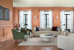
Renewed comfort, composed of shades that embody tranquility, comfort, and rejuvenation, according to the release. The 2024 color of the year, Persimmon is described as a grounded, earthy terracotta shade that feels energetic and refreshing.
Persimmon balances the energy of tangerine with grounded neutral undertones, making it perfect for spaces like living rooms and kitchens as it promotes positive relationships and conversation. The beautiful shade helps rejuvenate a space while bringing unique design visions to life.
Sounds pretty good to me.
And while these color collections are targeted at the residential market, it's likely that they'll make their way into the workplace as well, given the crossover trend we've been seeing in recent years, that's only accelerated since the pandemic.
In fact, an article in Steelcase’s Work Better magazine noted that color palettes in the workplace used to convey the message that they're all about business and reflected an aesthetic that was closely tied to technology that came off as cold and antiseptic.
Today, however, hybrid work is blurring the lines between work and home more than ever before, people want to experience the comforts of home when they are in the office. Recognizing this desire, designers are looking at how color can be used to create workplaces where people will feel good and where they want to be, the Steelcase article read.
It goes on to say that it's especially important that as we recover from a global pandemic and are still living in a time of uncertainty and volatility, stress, anxiety and the physical toll they take has impacted all of us. People are talking openly about mental health, and employees have heightened expectations of their employers and how they'll support their overall well being immersed in technology.
People yearn for more humanity, the authors say. They are seeking comfort, familiarity and a sense of sanctuary, and are drawn to places that create a soothing domestic sensibility.
So that got me thinking about the power of color in the built environment and color psychology, and it reminded me of an interesting phenomenon that got me thinking about the power of color in the built environment and color psychology, and it reminded me of an interesting phenomenon called drunk tank pink or Baker Miller Pink depending on who you ask.
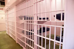
An article on the website Color Matters claims that Baker Miller pink, with Pantone RGB color values 255, 145 and 175 respectively, has been used to calm violent prisoners in jails. As the story goes, Doctor Alexander Schauss, PhD, director of the American Institute for Biosocial Research in Tacoma, WA, was the first to report the suppression of angry, antagonistic and anxiety ridden behaviors among prisoners.
Quote, even if a person tries to be angry or aggressive in the presence of pink, he can't. The heart muscles can't rate race fast enough. It's a tranquilizing color that saps your energy, even the color blind are tranquilized by pink rooms, Doctor Schaus was quoted as saying.
In spite of these powerful effects, there is substantial evidence that these reactions are short term, the article noted. Once the body returns to a state of equilibrium, a prisoner may actually regress to an even more agitated state.
Well, that's not good!
And given the Barbie core trend that's happening right now, I'm a little concerned that we'll start seeing Barbie dream houses popping up everywhere and an oversaturation of pink that will eventually wear on our collective nerves.
All kidding aside, the psychology of color is super interesting and not necessarily new, but there's not as much evidence based research on the subject as it relates to the built environment as you think. A blog post I read on the Unika Vaev website noted that modern color psychology research has focused on a few main areas, physiological responses to color, color preferences, and the effects of color on human emotions and behavior.
When studying physiological responses to color, researchers measure things like blood pressure, heart rate, and electrical activity in the brain to determine whether or not a color is physiologically arousing, the author stated. Colors that are arousing usually increased blood pressure, heart rate, and brain activity.
Think of the expression seeing red, for example, that elicits feelings of intense passion, while colors that are calming decrease them to observe people's behavioral responses to color, researchers often run experiments and simulations in the lab, the author noted.
How much impact color in a space has on occupants has yet to be seen, and of course color psychology is a complicated, nuanced field of study because people have unique responses to their environments.
What's pleasing to one observer may have a completely different impact on another. That's why designing inclusive environments that support neurodiverse populations are so important, and we'll cover that on another episode of the podcast, I promise.
But when we think about how the presence of different colors in the workplace will affect employees who are starting to come back to the office from their homes in greater numbers, I think Unika Vaev summed up the color conversation pretty nicely.
Overall, current research supports the idea that certain colors can have positive psychological effects on both your employees and customers, but you shouldn't rely on color alone to make your business base comfortable and functional.
Psychologists warn that a nice paint color won't make up for poor design, painting the walls and it's. Painting the walls a stimulating shade of red won't hide or distract from problems like improper lighting, uncomfortable furniture, and bad acoustics. To create the most welcoming environment for your customers and employees, you have to attend to all areas of design, not just color.
I couldn't said it better myself and that's really sound advice.
Well, hey, if you have thoughts on color psychology you'd like to share, head over to the i+s website at iands.design and click on the podcast tab at the top of the page where you'll be able to find this episode. Scroll down to the bottom and you'll see a new module below my byline, titled Voice Your Opinion.
We'd love to get your thoughts on this topic or on any of our other episodes, and if you haven't done so already, would you be so kind as to tell your colleagues about this podcast? We'd love to grow this community of listeners and get your feedback on the conversations we're having or should be having and what you'd like to hear more about.
Well, that's it for this mini episode.
I hope you've enjoyed it.
Thank you for tuning in and as always, be well, everyone.
About the Author
Robert Nieminen
Market Content Director
Market Content Director, Architectural Products, BUILDINGS, and interiors+sources
Robert Nieminen is the Market Content Director of three leading B2B publications serving the commercial architecture and design industries: Architectural Products, BUILDINGS, and interiors+sources. With a career rooted in editorial excellence and a passion for storytelling, Robert oversees a diverse content portfolio that spans award-winning feature articles, strategic podcast programming, and digital media initiatives aimed at empowering design professionals, facility managers, and commercial building stakeholders.
He is the host of the I Hear Design podcast and curates the Smart Buildings Technology Report, bringing thought leadership to the forefront of innovation in built environments. Robert leads editorial and creative direction for multiple industry award programs—including the Elev8 Design Awards and Product Innovation Awards—and is a recognized voice in sustainability, smart technology integration, and forward-thinking design.
Known for his sharp editorial vision and data-informed strategies, Robert focuses on audience growth, engagement, and content monetization, leveraging AI tools and SEO-driven insights to future-proof B2B publishing.


