What Dr. Seuss Can Teach Us About Interior Design for Kids
I became enamored with color theory and psychology in graduate school. While studying the history and theory of graphic design (a subject I have also taught), I began to wonder why Dr. Seuss held such reverence in our minds. Although he published his most famous works between 1937 and 1960, his books are still beloved today and, in many cases, have been passed down through generations.
As the science behind child psychology and color theory become more advanced, understanding the thought process behind Dr. Seuss’ graphic design can help interior designers to create more thoughtful designs for kids.
The Origins of Dr. Seuss’ Classics
Geisel’s artwork made it easier for children to understand the stories. And there was an interesting connection to child psychology with his use of color. His early works were printed with a limited color pallet due to technology at the time and the reluctance of publishers to spend money printing children’s books. But even as he became more famous and color printing became more widely available, Geisel took a painstaking approach to his color choices and didn’t vary from his layout patterns.
♦ 2020 Design Trends: Color, Materials + Finish ♦
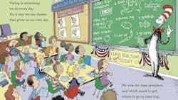
This could be part of his success. Throughout his 46 stories that feature his own artwork, Geisel used only warm colors and simplistic images with thick outline. He put his words alongside the images to which they corresponded. For example, while many children’s books place copy as block text, Geisel separated his copy so that “one fish” appears next to a singular fish and “red fish” corresponds to the only red fish on the page.
Complex Thought, Simplistic Design
For example, children tend to believe that the world resembles what they see in their own environment. Therefore, there is nothing unusual about the main character seeing a horse turn into a zebra—a horse and zebra look similar, after all. But a horse turning into a ‘ZEBRA’ emphasizes a differentiation between the two animals, showing that this change is uncommon and surprising.
The popularity of The Cat in the Hat in 1957 showed that combing illustration and text as supportive elements in books is important to the development of young readers. Managing the newly created Beginner Books series, Geisel created a list of rules that included, “There would be no more than one illustration on any page; the text should not describe anything that was not pictured, so that children could work out the story from illustrations alone; and the design of each pair of facing pages would interlock as an artistic unit.”
Color Theory and Child Psychology
In his 1913 autobiography, painter Wassily Kandinsky began, “The first colours that made a strong impression on me were bright, juicy green, white, carmine red, black and yellow ochre. These memories go back to the third year of my life. I saw these colours as various objects which are no longer as clear in my mind as the colours themselves.” Along with blue, the colors described by Kandinsky are the most prevalent hues in Geisel’s books and have become a signifying characteristic of his work.
Another notable aspect of Geisel’s color choices is the fact that he uses warm colors instead cool colors or a mix of the two. Warm colors contain higher amounts of red and yellow, while cool colors contain higher amounts of blue or green. Recent studies of color acquisition in two-year-olds show that the subjects have a wide grasp of colors by that age and appear to understand warm-cold boundaries. Subjects didn’t choose cool or warm colors for a particular reason, but once a child has made a preference for one over the other, they tend not to mix warm and cool colors on a page.
Geisel may have been exposed to the new studies of color theory in the mid-twentieth century, but it’s more likely that he had an intuitive understanding of what kids liked. He once remarked that children’s art was “…pen-and-ink outlines filled with flat color, with no modulation and no subtlety… That’s just the way kids see things.”
What Interior Designers Can Learn from Dr. Seuss
Today, we have resources to understand child psychology. But much of what interior designers need to know about designing for children’s spaces—schools, libraries, pediatric hospitals and community centers—can be taken from Dr. Seuss.
When designing for children, interior designers should remember:
- Keeping a color pallet to either warm or cold primary and secondary colors is preferable
- Lines can be exaggerated and don’t need to be flush or straight
- Designs should exist on a child’s level, whether that means simplistic or literally at the 2- to 3-foot scale so kids can interact with them
- Using text alongside physical representations of the word’s meaning can aid child literacy
Kids may be tiny humans, but they aren’t small adults. Designing for the growing, active mind is imperative to their understanding of the world and how they learn. Turning to old favorite books can help you discover the tried-and-true methods for designing for children’s spaces.
About the Author

Kadie Yale
Former Editor-in-Chief
Kadie Yale holds a BA in Industrial Design from San Francisco State University and a MA in Decorative Art History and Theory from Parsons the New School. In her role as editor-in-chief from 2015-2018, she led the interiors+sources team in creating relevant content that touches on sustainability, universal design, science, and the role of design in society.
