Sherwin-Williams’ ‘Loneliest Color’ Brings Offbeat Color Into Focus
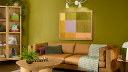
Bold color choices are finding new relevance in commercial interiors. Sherwin-Williams’ selection of Offbeat Green SW 6706 as its 2026 Loneliest Color points to growing demand for spaces that feel distinctive, memorable, and deeply personal.
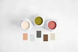
The Loneliest Color is an annual designation for the company's least-tinted shade, challenging designers to consider which colors deserve a place in today’s built environment. This year's selection, a vivid citric green, reflects a broader cultural shift toward individuality, self-expression, and environments that feel distinctly personal.
For architects and interior designers, the announcement offers more than a conversation about color. It signals that more clients and occupants are open to unconventional design choices that create memorable experiences and emotional connections to a place.
“This year’s Loneliest Color shows that even an unexpected choice can become something beautiful and approachable in the right setting. It’s a powerful reminder that the most authentic spaces are the ones shaped by what feels right to you, not by what’s popular,” said Sue Wadden, director of color marketing at Sherwin-Williams.
Bold greens have often been challenging to specify, but Offbeat Green demonstrates how high-energy color can succeed when used intentionally. The trend arrives as designers across the workplace, hospitality, education, and community-focused projects seek alternatives to neutral-heavy palettes. Strategic applications of energetic greens can support wayfinding, reinforce brand identity, create focal points, and contribute to environments that feel optimistic and engaging.
The announcement also connects the campaign to social impact. Through its collaboration with the LeBron James Family Foundation, Sherwin-Williams is extending The Loneliest Color beyond color forecasting through the PROMISE Project by Sherwin-Williams, a home education center designed to support first-time homebuyers in Akron, Ohio.
That partnership gives the campaign a more practical design message: Color can influence how spaces feel, who feels welcome in them, and how design choices support confidence, visibility, and opportunity.
For design professionals, the significance of The Loneliest Color may not be the specific shade itself, but what it represents. As clients increasingly seek spaces that foster authenticity and emotional connection, unconventional colors are gaining relevance as tools for creating environments that stand apart from the expected.
Whether used as an accent, incorporated into branded environments, or applied to create moments of surprise and delight, Offbeat Green serves as a reminder that meaningful design often emerges from choices that challenge convention. In commercial interiors, overlooked colors may offer designers another way to create spaces that feel memorable, expressive, and more human.