Sherwin-Williams Takes New Approach to the Colormix Forecast
Sherwin-Williams has introduced the Colormix Forecast 2024, Anthology: Volume One, a new biennial approach to the annual color trend report. This recurring color reference will alternate each year with the usual style and trend storytelling that the brand is known for. Looking ahead to 2024, the very first Anthology collection explores the directional shifts of four chromatic families, diving into the meaning behind the chosen colors, their role in awakening modern aesthetics, and what their future holds.
Also available is the Colormix for Commercial Spaces—an exclusive design resource applying the trend-forward collection of Anthology: Volume One to the commercial landscape. As the team of experts craft the Colormix Forecast, they weave key commercial colors into each palette–curated intentionally for designers, architects and other visionaries. These hues are poised to play an influential role in shaping the innovative space of hospitality, education, healthcare, multi-family and beyond. Designers can connect with their account executive for exclusive materials and events, and samples can be ordered with a PRO+ account.
Comprising 48 hand-selected hues, the expertly curated collection will explore blues and greens; reds and purples; deeps and darks; delicate tints. "Through the launch of Anthology, we are thrilled to diversify our yearly color forecasting report to show the depth behind each color trend for the coming year," said Sue Wadden, director of color marketing at Sherwin-Williams. "In releasing a new volume of the Anthology collection every other year, we hope to bring new color insight to the distinct chromatic families that our designers, industry pros, and savvy DIYers have come to know and love. These palettes–organized by color family for ease of use–will represent the beautiful shifts we are seeing within the world of color here at Sherwin-Williams." Here's a quick look behind each:
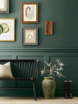
Palette No. 1–the convergence of blues and greens
- Jacarranda SW 6802
- Georgian Bay SW 6509
- Indigo SW 6531
- Upward SW 6239
- Stardew SW 9138
- Smoky Azurite SW 9148
- Honeydew SW 6428
- Evergreen Fog SW 9130
- Pewter Green SW 6208
- Aquastone SW 9043
- Leapfrog SW 6431
- Billiard Green SW 0016
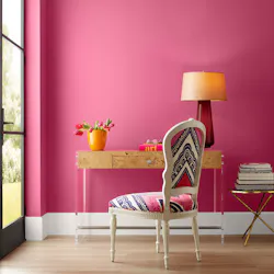
Palette No. 2–the poetry of reds and purples
A display of dynamic and nostalgic pops, the palette ranges from warm red tones to soft and cheerful pinks and purples. Balanced by natural- Habanero Chile SW 7589
- Ravishing Coral SW 6612
- Dragon Fruit SW 6855
- Sashay Sand SW 6501
- Wild Currant SW 7583
- Rhapsody Lilac SW 6828
- Soft Apricot SW 6352
- Fireweed SW 6328
- Redend Point SW 9081
- Verri Berri SW 9069
- Intuitive SW 6017
- Chinchilla SW 6011
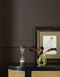
Palette No. 3–a gathering of deeps and darks
- Half-Caff SW 9091
- Antiquarian Brown SW 0045
- Mossy Gold SW 6139
- Sealskin SW 7675
- Roycroft Bronze Green SW 2846
- Palm Leaf SW 7735
- Carnelian SW 7580
- Gale Force SW 7605
- Rock Bottom SW 7062
- Raisin SW 7630
- Tricorn Black SW 6258
- Peppercorn SW 7674
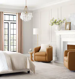
Palette No. 4–a study in delicate tints
- Snowbound SW 7004
- Drift of Mist SW 9166
- Light French Gray SW 0055
- Heron Plume SW 6070
- Modern Gray SW 7632
- Sand Dollar SW 6099
- Egret White SW 7570
- Skyline Steel SW 1015
- Jogging Path SW 7638
- Fleur de Sel SW 7666
- Silver Strand SW 7057
- Silvermist SW 7621


