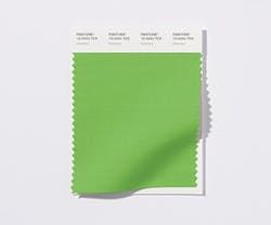
PANTONE Unveils 2017 Color of the Year
PANTONE’s Color of the Year for 2017 is Greenery (PANTONE 15-0343). The company has described Greenery as a “fresh and zesty yellow-green shade that evokes the first days of spring when nature’s greens revive, restore, and renew. Illustrative of flourishing foliage and the lushness of the great outdoors, the fortifying attributes of Greenery signals individuals to take a deep breath, oxygenate, and reinvigorate.”
Leatrice Eiseman, executive director of the Pantone Color Institute, explained, “While Serenity and Rose Quartz, the PANTONE Color of the Year 2016, expressed the need for harmony in a chaotic world, Greenery bursts forth in 2017 to provide us with the hope we collectively yearn for amid a complex social and political landscape. Satisfying our growing desire to rejuvenate, revitalize, and unite, Greenery symbolizes the reconnection we seek with nature, one another, and a larger purpose.”
PANTONE’s Color of the Year is visible through various segments of design and the marketplace, including fashion, beauty products, graphic design, interior design and décor, and architecture. With a focus on bringing nature into our everyday lives, most recently through the growing popularity of biophilic design, Greenery will be visible in interiors via paint, accent furniture, living walls, botanically themed wallpaper, terrariums, and other decorative elements, bringing a sense of relaxation to a space. In addition, as an accent color, Greenery can bring a pop of color by way of an accent wall or striking piece of upholstered furniture, for example. According to PANTONE, “Bringing the outside in, the shade—like the plant life it represents—can improve self-esteem, reduce anxiety, and heighten awareness of one’s surroundings.”
