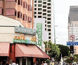
Nestled amongst the teetering skyscrapers of downtown Los Angeles that grew up around it over time, The Pantry is an unassuming 24/7 diner that originally opened in 1924—and hasn’t closed since. In fact, the front doors are without locks. (There was an exception in 1997 when The Pantry was closed for minor health code violations, just to be reopened by order of Mayor Dick Riordan the next day.) Frequented by politicians and celebrities alike, the Los Angeles Historic-Cultural Monument is unassuming with a coffee counter and booth seating. Its charm is that it is a space which seemingly ignores keeping up with the times, choosing to instead appreciate its roots no matter how popular it becomes.
A large part of that commitment to its 1920s aesthetic lies in the signage used. Beginning his career more than six decades ago, veteran sign painter Chuck Huedepohl has been creating signage for The Pantry for almost 25 years. Due to his expertise in lettering, The Pantry’s signage looks as if it has been unchanged since the doors opened. However, as The Pantry’s manager David Wall explained, part of the simplicity about the signage is in the work and thought that goes behind every new ideation.
As hand lettering and mechanical reproductions of historical signs become more popular, particularly in boutique and restaurant settings, designers need to take special consideration of how it ties into the overall aesthetic rather than leaving it as an afterthought.
The Allure of Signage
According to Bob Behounek, a renowned sign artist with 40 years of experience, the attachment to handmade signage lies in the emotional connection to the sign painter. The use of hand-lettered signs in a contemporary setting can tap into that personal aspect.
“The restaurants in Chicago use hand-lettered signs, and it gives it an emotional feel,” Behounek explained. “[The Potbelly chain] hired people all over the country to hand paint their signs, so the restaurant looked emotional; you had an attachment when you walked in there. So, lettering went from mainstream to specialty because people understood that this type of artwork can draw people into your establishment because of how it looks. It’s not totally perfect—it may be off a bit here and there.”
Understand expectations: Historical Styles Don’t Match Reality
While patrons come to The Pantry expecting an authentic experience,their thoughts on what 1920s signage looks like and the reality do not always match. Behounek said the reasons are, essentially, due to advancements in technology. “Back in the day, they didn’t have good paint, and they only had a few letter styles to use. Sign painters took a little bit of this, a little bit of that—they made it work. But today, clients wouldn’t accept that. If you covered a restaurant’s walls with that, I would personally walk in and say, ‘Wow,’ but someone who doesn’t know [about historical lettering] would say, ‘What’s this?’ You have to be careful, and you have to blend it all together to make it work these days.”
In short, what today’s audience thinks historical styles looked like does not meet the reality of hodgepodge letterforms and less-advanced paints.
Using the Past as a Template
In trying to reconcile realities and assumptions of historical signage, Huedepohl’s background and abilities ensure the signage at The Pantry harkens back to its roots while meshing with customers’ expectations. “We’ve gone vinyl in the last 25 years or so,” he noted. “[Lettering has] gone to layouts that start from your experience with hand lettering. As far as the look, [manager David Wall] wanted something new from what was up there before. We wanted to keep the same color, more or less, but they’re going to be much livelier.”
Similarly, while past signage for The Pantry was a mix of letter styles, the updated version will stick to the same lettering, utilizing different sizes and heaviness. As contemporary signage is more homogeneous, it’s important to take aspects from historical styles and interpret them to give the illusion of an era without directly copying.
Consider How it Will be Used
These days, a good hand-lettered sandwich board can do more than bring in patrons from off the street; witty sayings and aesthetically appealing lettering have found a place being shared on social media platforms, potentially giving businesses free advertising.
While signage on the interior of a business sets the ambiance, because it is more permanent than sandwich boards, the primary purpose should be the ease in which it can be utilized by patrons. Regarding The Pantry, Huedepohl said, “The first thing we consider is the distance. At The Pantry, people were getting up and going to the signs a lot, so [the redesign had] to be real readable without a lot of decoration. The important thing is that people come in and sit down, then they’re looking for a menu—if they’re new especially. So, the signs have to be legible from 10 to 15 feet away. That’s the first criteria: to be legible.”
Thinking Through Changes
While the outcome of signage depends on the artist and establishment, another important aspect to consider are the changes that will need to be made down the road. For The Pantry, even if the aesthetic stays the same, there’s one thing that will always keep up with the times: the pricing. “I used to come in at night and change the prices all the time,” Huedepohl explained. “But that’s not necessary anymore because we have blackboard panels. [Management] can change it with a chalk pen.” Keeping in mind that the signage could be there for years, thinking
through the changes that will be made during its duration can nix problems down the road.
Photography by LaNell Gardner
About the Author

Kadie Yale
Former Editor-in-Chief
Kadie Yale holds a BA in Industrial Design from San Francisco State University and a MA in Decorative Art History and Theory from Parsons the New School. In her role as editor-in-chief from 2015-2018, she led the interiors+sources team in creating relevant content that touches on sustainability, universal design, science, and the role of design in society.