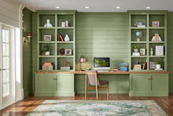
Valspar’s 2022 Colors of the Year Offer Wide Range of Warm Colors
Paint and coatings brand Valspar has announced its 2022 Colors of the Year with 12 trend-worthy and forward-thinking natural shades that evoke warmth, calm and comfort. With this palette, Valspar seeks to empower consumers to think positively about the future while creating spaces in their homes that provide solace and a comfortable feeling in the present.
When forecasting the 2022 Colors of the Year, the color experts at Valspar observed global lifestyle trends that encompass culture, media, fashion, design, food and technology. A home's appearance can directly impact a person's mindset and this year's colors have been selected to bring a sense of soothing tranquility to the walls, ultimately blending the safety of the home with the calmness a beautiful shade of paint can bring.
"Colors can power moods, energizing us with confidence, strength and curiosity–allowing us to express ourselves with color anywhere–whether it be a full room, an accent wall, trim or furniture," said Sue Kim, Valspar Color Marketing Manager. "Valspar's 2022 Colors of the Year provide consumers a wide range of naturally based warm colors that will not only help calm the nerves and boost the mood, but also provide a confidence in what the future may hold."
Valspar's 2022 Colors of The Year help take the guesswork out of color selection, so that consumers can easily navigate DIY projects and take charge of their physical spaces, to help foster their best mental space. No need to completely redesign a room when a fresh coat of paint can make it feel like a new space and improve the mindfulness of those who use it.
Each of the 12 Colors of the Year cultivate a sense of calm and comfort that creates the ideal backdrop for an optimistic outlook on what's to come. Valspar has curated these 12 trending hues to include a range of shades that provide flexibility and can be incorporated into existing design elements. For the third year in a row, the 12 Valspar Colors of the Year were photographed in people's homes, giving the colors and images an aesthetic that represents the lifestyles of today's paint buyer.
The 2022 Colors of the Year
See below for the full list of colors and how they breathe life into spaces.
Blanched Thyme–Calming and nourishing, this natural shade encourages a calm balance within yourself and your home.
- Design tip: Natural greens remain an important color to bring into the home as consumers continue to focus on their physical and mental well-being.
Gilded Linen–Soft and cozy, this minimalist white gives you space to breathe and declutter your mind.
- Design tip: This color helps create coziness and helps a space feel more serene with added softness.
Delightful Moon–A color that radiates warmth, this shade has a new take on sophistication, expanding the natural tones we bring into the home.
- Design tip: Warm shades of yellow, reminiscent of honeycomb, accomplish an uplifting feel in a sophisticated way.
Lilac Lane–A fresh shade with beautiful versatility, soothing and restorative, it brings a new softness into the home.
- Design tip: Shades from the purple color family are associated with spirituality and creativity, crafting a space that promotes good mental health.
Mountain River–A natural hue with depth feels like an indulgent escape within the home.
- Design tip: Deep and dark blues have duality. Used in small doses, they feel indulgent and luxurious. Used as an all over color, they create a safe space that allows you to escape.
Orchid Ash–Pure and clean, the simple quality of the shade creates a mindset for a hopeful future.
- Design tip: Light and pure, cool shades shift feelings to the purity of the arctic.
Grey Suit–Dependable and reliable, this warm gray works well in any setting, in any home.
- Design tip: In a time of uncertainty, we are looking for dependability. The slight red undertone of this shade embraces the shift in temperature of colors being brought into the home.
Subtle Peach–A simple pastel that brings us back to basics, its natural quality gives a lived-in attribute that feels clean and modern.
- Design tip: There is a beauty in simple colors that feel slightly lived-in, embracing natural pastel shades for their uplifting and calming qualities.
Rustic Oak–A warm shade reminiscent of copper, creating a space for us to feel protected and comforted.
- Design tip: Evocative of shades from the 70's and 90's, this color is rooted in nostalgia, comforting to younger generations in uncertain times.
Sunset Curtains–We have embraced warm neutrals back into the home for comfort, a familiar hue that is reassuring.
- Design tip: Tinted neutrals have comforting and tranquil qualities. The nostalgic feel of this shade is reassuring without being too overwhelming.
Country Charm–Create a space to relax and unwind with warm, comforting charm.
- Design tip: Neutral shades that feel slightly muddy provide a space to create our personal sanctuary. This shade feels relaxing but with a nostalgic charm.
Fired Earth–A classic shade with warm depth, this shade evokes a feeling of stability and comfort.
- Design tip: Dark hues with a dose of warmth bring a newfound coziness, making us feel protected and comforted.
Want more color reveal stories? Check out these recent announcements:
About the Author

Adrian Schley
Associate Editor
Adrian Schley was an Associate Editor for i+s, where she covered the commercial interior design industry since 2018. Her work can also be found in BUILDINGS and Meetings Today.
